Client: SHINTO SHIATSU MASSAGE is a newly founded (2018) company in Crete, Greece.
Project: We were hired to design the new Winter Offers Campaign including posters, flyers and gift vouchers with their envelopes.
Briefing: The owner is a dedicated student of Japanese therapeutic methods, and has a great experience on the subject of this particular oriental culture. The brand´s identity colours are two different blues, white and salmon (pale pinkish-orange to light pink). We were also provided with a set of photographs by Charlie Kartsolis.
Execution: We based the campaign´s design on a deep blue background, using the white and salmon colours for the type and graphic elements.
This past week we created a new collection of illustrations: the Animal Farm! Up to now, the collection includes the sheep, cow, horse and donkey characters and we´re working on the rest of the gang! 😉
The perfect decor for a child´s room, they are all available in a great range of designer products in our e-shops at Redbubble and Society6.
Hello everybody! This has been a very exciting year for us at Yellow Studio. Reviewing & renewing our brand and corporate identity about a year ago has been a daring but wonderful adventure!
The studio was founded in 2011. Last July we decided to take the big step and rebrand, creating for ourselves a new, strong identity. With new people on the team, and our services varying from graphic to interior design, animation, photography and marketing, we had to rethink what would represent us all and -of course- a way to reposition us on the market.
So here’s the story of how we did it (or a few notes on rebranding)!
Rebranding is the creation of a new visual and social identity for a business or a product by effectuating a partial or complete change of name, logotype design, products and/or a new marketing strategy that addresses a new social community.
Why do companies rebrand?
Rebranding is important to small companies and big corporations equally, under specific circumstances, such us evolution (changes in ownership, leadership or size and reach of the business), internationalization (entering new markets), need to reposition the brand on the market (renewed line of products, change in target niche, bad or no reputation etc) or simply differentiation (stand out from the crowd).
The most important tool: Briefing
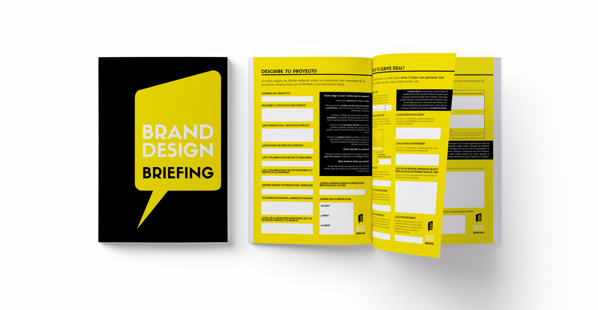
The first step was filling in our own brand design briefing questionnaire, an 8-page long working tool we always ask our clients to fill in. It consists of a list of questions about both the client and the project, and it helps us understand the characteristics we need to take into consideration before we start designing the brand’s identity. These questions provide information on the product or service the client is offering, the target group they are aiming for, their style preferences etc..
This is one of the most important (if not THE most important) parts of the whole procedure of creating a brand’s identity. A detailed briefing can save you from a lot: misunderstandings, hours of reviewing and correcting, problems in communicating with the client, etc.. Knowledge is power!
It also helps you get an insight on whether you really want to work with this specific client or not (I know sometimes you cannot afford to say no to a client, but believe me, it’s always a good thing to do when you see from the beginning it’s not going to work smoothly). It’s generally a good idea to use a printed questionnaire for your brand design briefing, give it to your client to take home, sit down, think and fill it in. It always makes things clearer for him/ her and helps them understand better what they are looking for.
In a nutshell, in order to successfully rebrand your business you need to:
Know the story of your brand. Who is your audience, what makes them resonate with a product?
Analyze your current branding in the circumstances of your market. How the consumers view your current brand, what they expect from you and how the market is changing in order to change with it not the other way.
In our case, filling in the briefing document took us quite a long time. It’s always more complicated when you are both the client and the designer. When we were happy with our answers, we finally moved to the next step:
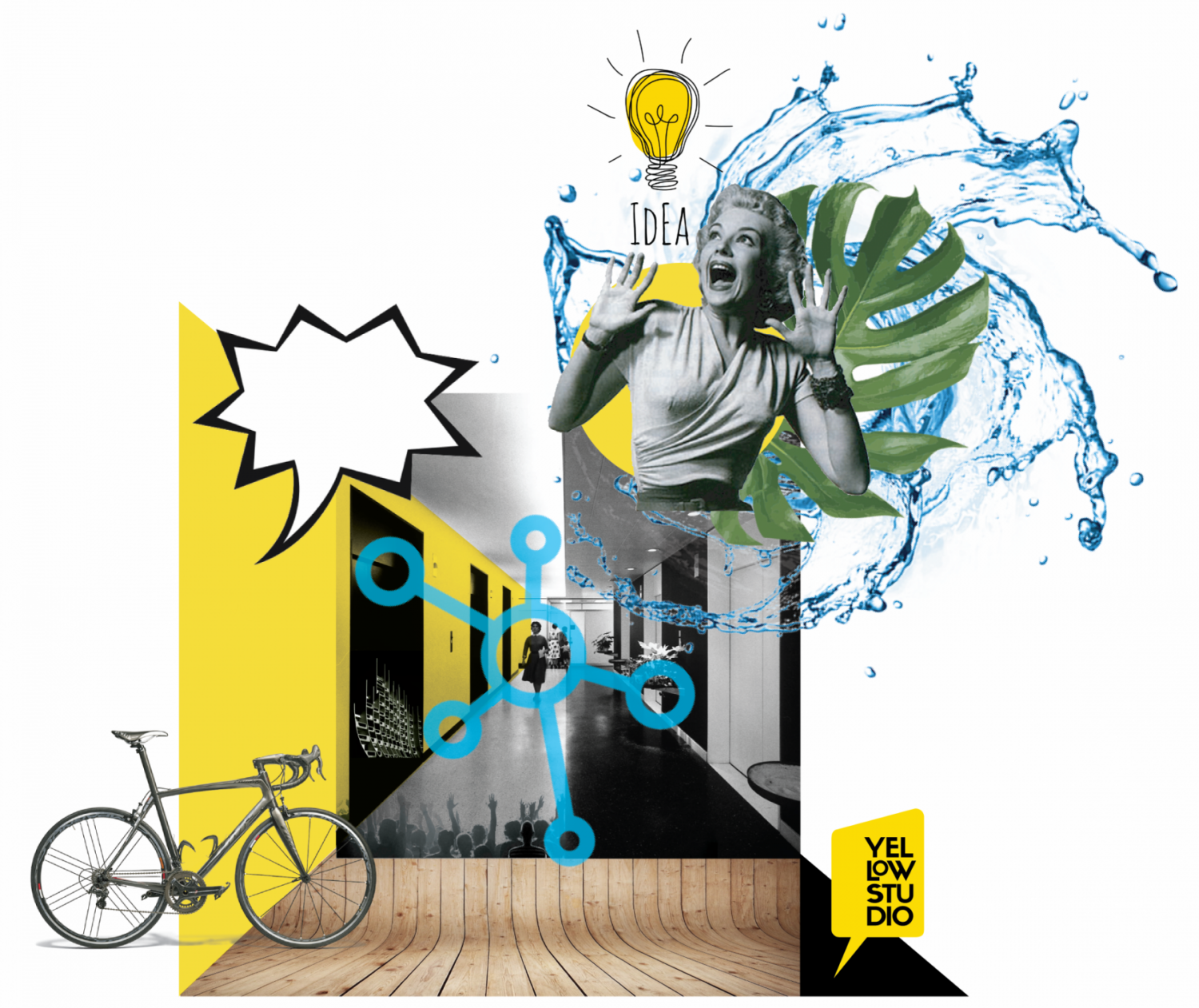
The mood-board
The mood-board is a graphic representation (a collage of images or sketches) that best describes the idea behind the brand. It is one of the most difficult, but also the most creative of processes.
A creative interpretation of the briefing questionnaire, the mood-board’s intention is to explain feeling through images.
With a background in architecture, I’m used to expressing thoughts and feelings with images. For me personally, it’s a way to take notes without writing words down. It doesn’t really matter where the images come from: this is a private tool (one that you normally never publish or even show your client) and you can use any material available to you found online or from magazines, books, sketches, etc.
Logotype design After finishing with the analysis of the brand´s goals with both words and images, we start sketching different ideas for the logo. It is very important for us to start this process with pencil/ pen and paper before concluding on a specific design and creating the digital and final archive in Illustrator. We always make sure that the final design works perfectly with bright and dark backgrounds by either choosing a colour that works well with everything or creating the logo´s negative.
There is no brand without an official logo and a carefully designed visual identity. This is the starting point whether the business is rebranding or starting their first branding process.
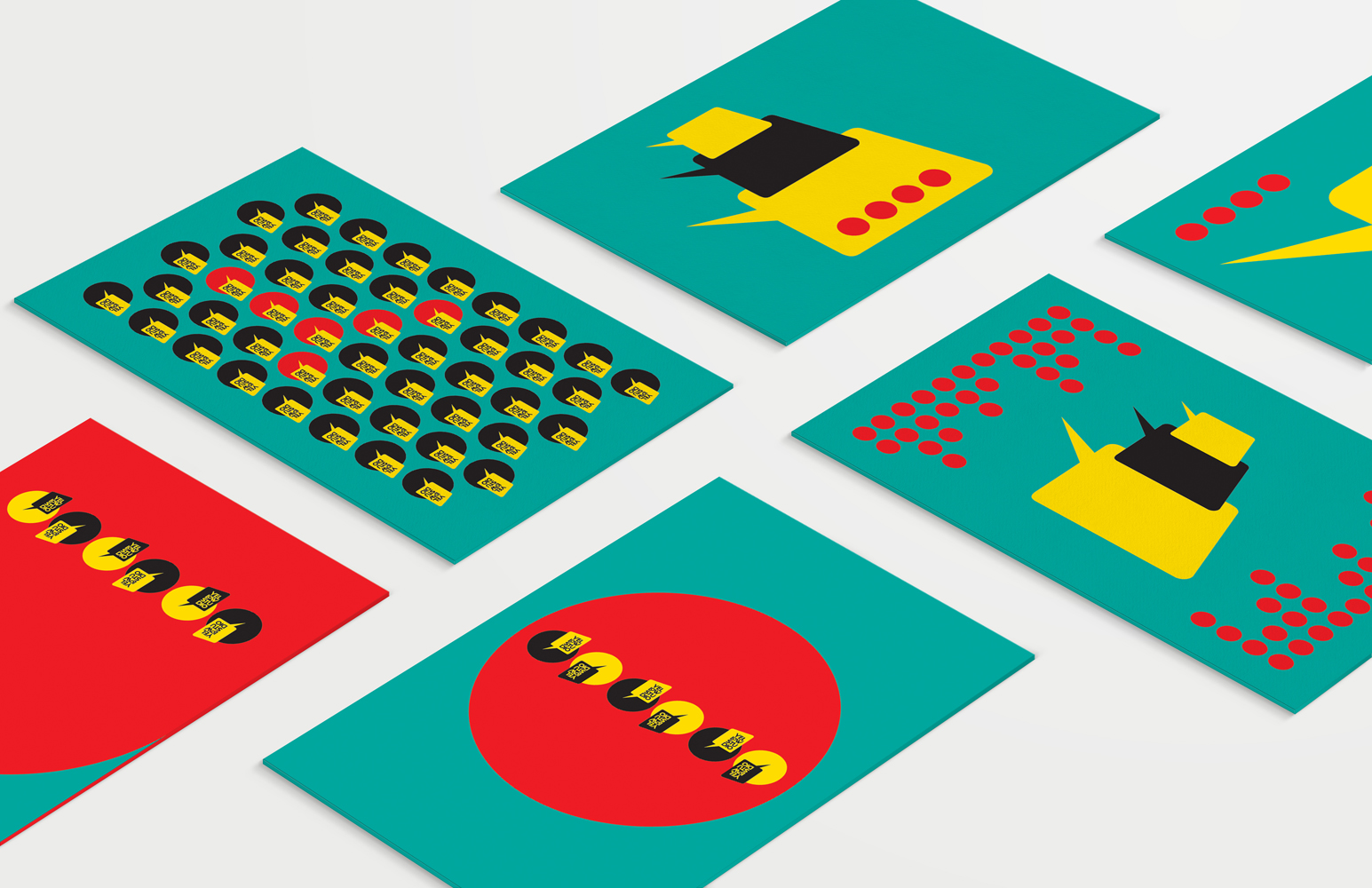
For our brand, I chose to create a graphic logo, one that has a yellow background and no transparency behind the name. Using a strong background for your logo (in our case the talk bubble) gives the advantage of use at all sizes as a trademark, or a “stamp”.
Corporate identity manual
Once the main visual representation (logotype) is fixed, we start working on the brand´s identity manual.
The manual is a corporate identity management tool thatcontains guidelines for the correct application of the brand´s identity.
Briefing and mood-board at hand, we start building the corporate identity manual by choosing the right colours to be associated with the brand, the fonts, sign and banner design, avatars, visual content strategy and everything else that may be associated with the visual identity.
Conclusion
We hope we´ve helped explain what the rebrand procedure is like. For us, taking the decision and flipping to a new, colourful page has been nothing but a great success.
If you feel like a change is needed for your brand, make sure you have the time to plan it carefully. We would advise you to ask for the help of specialists. We strongly believe it´s worth the investment, considering the impulse that a good rebrand can create for your business.
The only important thing to be remembered is Consistency! Visual content needs to be consistent with the brand´s story at all times and at all locations.
If you enjoyed this post or have something to contribute, please leave a comment here, or contact us here.
Client: Part of our voluntary work, this month we collaborated with the Non-profit Organization “AssociacióProyectosInfantiles//Empresa d’inserció Inserjobs, SCCL”*
Project: The production of the identity for their new NGO project “Fast Rabbit” and the design of a promotional printed brochure.
Briefing: We were initially asked to create a brochure advertising the new project. When prompted about the new endeavour´s identity, the NGO requested our help in designing the whole brand identity which was non-existent.
“FastRabbit” is a new delivery company that:
uses bicycles in an effort to be ecologically relevant and at the same time
provides work to young people in danger of social exclusion.
Execution: We started draughting the logo after analyzing the briefing´s detailed information. At the time, we worked with the name “Green Rabbit”, as the NGO had not completed a full research on the naming in the beginning. Apparently, there existed another company by that name, so they had to change it to “Fast Rabbit”.
In the creation of the final design, we took into consideration both the ecological and the social sides of the project. We decided to play with the Rabbit as a trademark, combining it with the Bs of the word Rabbit. We are still in the process of creating the brochure.
We hope you enjoyed what we´ve done with the project. Feel free to add your comments here below or, if you have a similar project in mind, please drop us a line here. We´ll be glad to hear from you!
This month we launched a competition on Instagram and Facebook for the chance to win a personalized portrait of any person you want, designed especially for you by Yellow Studio.
To participate FOLLOW Yellow Studio + COMMENT under the video EITHER ON OUR INSTAGRAM OR FACEBOOK PAGE!
The winner (randomly chosen) will be announced on Friday the 18th and will receive his/her portrait soon after that! 😊 Good luck to you all!
Legendary Women is a project we started back in March. Every month we create a vectorial illustration of a woman we consider to be exceptional.
MARCH: DIANE ARBUS MARCH’s selected personality is an iconic photographer, Diane Arbus.⠀
APRIL: BILLIE HOLIDAY APRIL´s portrait is dedicated to the wonderful Billie Holiday. One of our favourite jazz singers, and a person with a deep professional and emotional influence on others.
MAY: KATHARINE HEPBURN This month, “Legendary women” project is back with Katharine Hepburn, the amazing actress known for her fierce independence and spirited personality that made a difference. Hepburn famously shunned the Hollywood publicity machine and refused to conform to society’s expectations of women. She was outspoken, assertive, athletic, and wore trousers before it was fashionable for women to do so. She was named the greatest female star of Classic Hollywood Cinema by the American Film Institute.
We hope you like this project. Please find all related products at our eShops here:
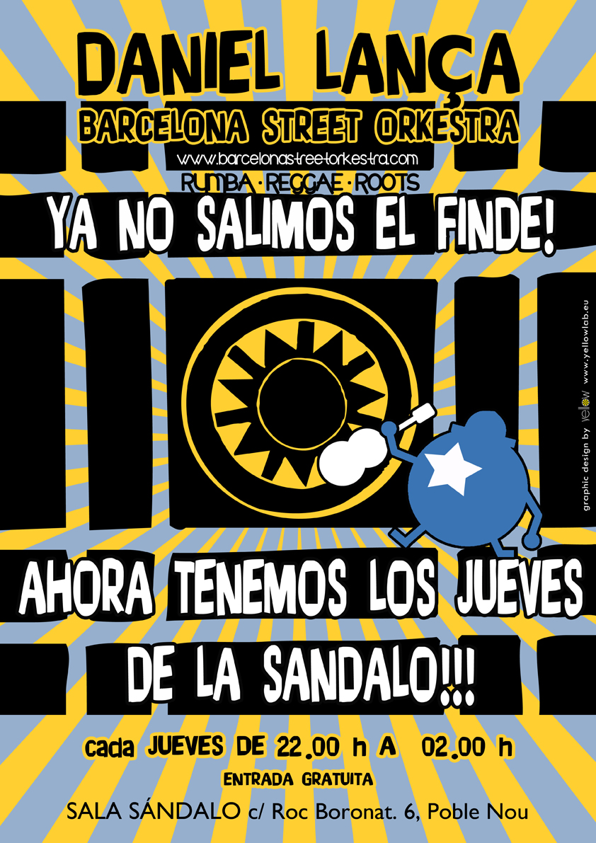
De 22.00 h a 2.00 h, entrada gratis. Ven a disfrutar con nosotros esta noche de fiesta, desde la Rumba al Reggae y del Afro al Ska acompañado de una seleccion musical Afro, Latin y WorldMusic a cargo del “Selecta Hormiguita”.
Daniel Lança BarcelonaStreetOrkestra:
Aymarà Lugones – bateria Sebass Martinez – bajo elec. Chawki Dahbi – guitarra electrica Daniel Lança – guitarra acústica & voz más invitados…
Sala Sandalo–Metro Llacuna L4–Poble-Nou (la Sala està a 3 cuadras del metro)
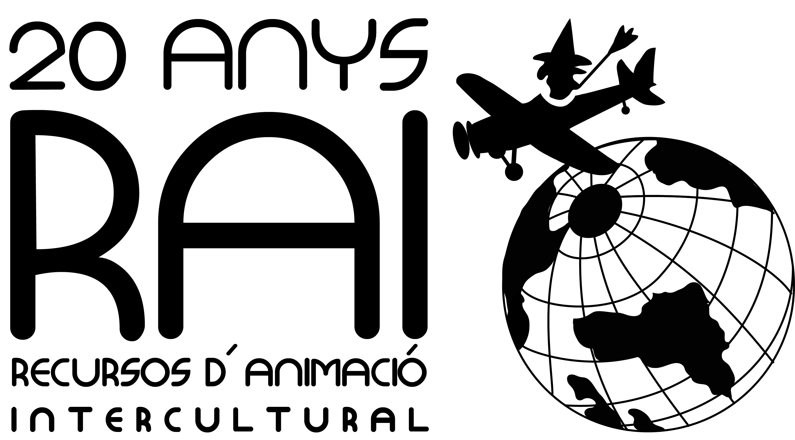
Acabamos de entregar el nuevo logotipo para el RAI (RECURSOS D´ANIMACIÓ INTERCULTURAL), un espacio que lleva ya unos 20 años en la vida cultural de Barcelona.
RAI es una asociación asamblearia e independiente, que funciona como una plataforma de proyectos para la transformación social, cultural y educativa, ofreciendo un ámplio abanico de recursos e iniciativas a través de la interculturalidad, el antiracismo, la participación activa, la autonomía y el empoderamiento individual y colectivo.
Nació en Barcelona en 1993, como una entidad que organizaba intercambios internacionales para jóvenes que qerían hacer un viaje original de conocimiento de otras realidades, pero las experiencias vividas por toda la gente que ha pasado por RAI ha hecho crecer este proyecto, generando múltiples formas de participación.
Se pueden identificar las líneas estratégicas de RAI en 3 ramas: la pedagógica, la de acción social y política y la artística y cultural. A través de ellas se ramifican los ámbitos de actuación y las actividades concretas que se llevan a cabo.
Su logotipo antiguo, que no había cambiado por unos 20 años, fue bastante reconocido entre la gente de la ciudad, así que al diseñar el nuevo tomamos la decisión de guardar sus conceptos básicos, cambiandole al mismo tiempo la imagen por otra más moderna.